Know thy enemy: How to prioritize and communicate risks—CRE life lessons
Matt Brown
Customer Reliability Engineer
Accelerate State of DevOps Report
Get a comprehensive view of the DevOps industry, providing actionable guidance for organizations of all sizes.
DownloadEditor’s note: We’ve spent a lot of time in CRE Life Lessons talking about how to identify and mitigate risks in your system. In this post, we’re going to talk about how to effectively communicate and stack-rank those risks.
When a Google Cloud customer engages with Customer Reliability Engineering (CRE), one of the first things we do is an Application Reliability Review (ARR). First, we try to understand your application’s goals: what it provides to users and the associated service level objectives (SLOs) (or we help you create SLOs if you do not have any!). Second, we evaluate your application and operations to identify risks that threaten your ability to reach your SLOs. For each identified risk, we provide a recommendation on how to eliminate or mitigate it based on our experiences at Google.
The number of risks identified for each application varies greatly depending on the maturity of your application and team and target level for reliability or performance. But whether we identify five risks or 50, two fundamental facts remain true: Some risks are worse than others, and you have a finite amount of engineering time to address them. You need a process to communicate the relative importance of the risks and to provide guidance on which risks should be addressed first. This appears easy, but beware! The human brain is notoriously unreliable at comparing and evaluating risks.
This post explains how we developed a method for analyzing risks during an ARR, allowing us to present our customers with a clear, ranked list of recommendations, explain why one risk is ranked above another, and describe the impact a risk may have on the application’s SLO target. By the end of this post, you’ll understand how to apply this to your own application, even without going through a CRE engagement.
Take one: the risk matrix
Each risk has many properties that can be used to evaluate its relative importance. In discussions internally and with customers, two properties in particular stand out as most relevant:- The likelihood of the risk occurring in a given time period.
- The impact that would be felt if the risk materializes.
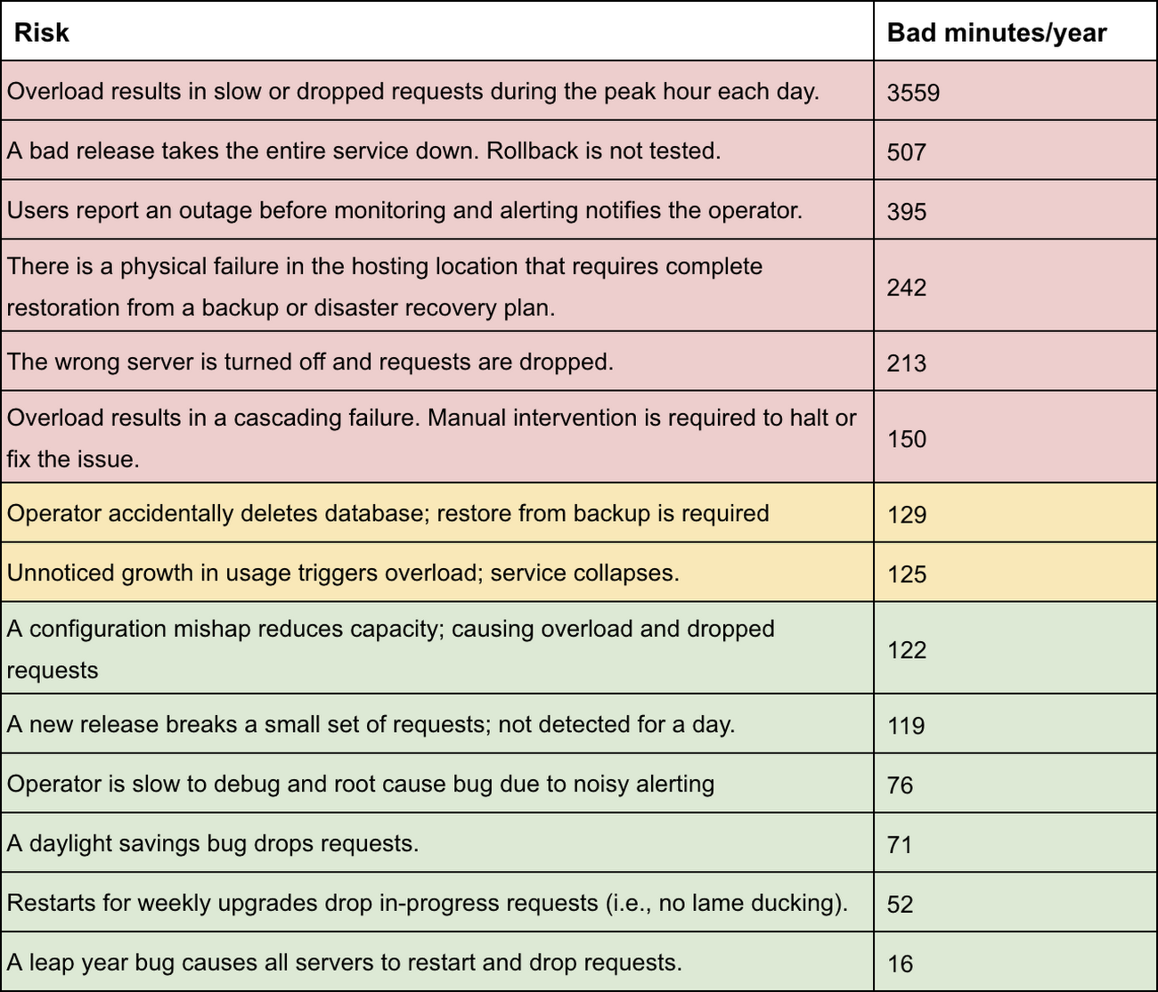
Example table with representative risks for each category: The row headers represent likelihood and column headers represent impact.
| Catastrophic | Damaging | Minimal | |
| Frequent | Overload results in slow or dropped requests during the peak hour each day. | The wrong server is turned off and requests are dropped. | Restarts for weekly upgrades drop in-progress requests (i.e., no lame ducking). |
| Common | A bad release takes the entire service down. Rollback is not tested. | Users report an outage before monitoring and alerting notifies the operator. | A daylight savings bug drops requests. |
| Rare | There is a physical failure in the hosting location that requires complete restoration from a backup or disaster recovery plan. | Overload results in a cascading failure. Manual intervention is required to halt or fix the issue. | A leap year bug causes all servers to restart and drop requests. |
We tested this approach with a couple of customers by bucketing the risks we had identified into the table. This is not a novel approach. We very quickly realized that our terminology and format are the same as that used in a risk matrix, a commonly used management tool in the risk assessment field. This realization seemed to confirm that we were on the right track, and had created something that customers and their management could easily understand.
We were right: Our customers told us that the table of risks was a good overview and was easy to grasp. However, we struggled to explain the relative importance of entries in the list based on the cells in the table:
- The distribution of risks across the cells was extremely uneven. Most risks ended up in the “common, damaging” cell, which doesn’t help to explain relative importance of the items within each cell.
- Assigning a risk to a cell (and its subsequent position in the list of risks) is subjective and depends on the reliability target of the application. For example, the “frequent, catastrophic” example of dropping traffic for a few minutes during a release is catastrophic at four nines, but less so at two nines.
- Ordering the cells into a ranking is not straightforward. Is it more important to handle a “rare, catastrophic” risk, or a “frequent, minimal” risk? The answer is not clear from the names or definitions of the categories alone. Further, the desired order can change from matrix to matrix depending on the number of items in each cell.
Risk expressed as expected losses
As we showed in the previous section, the traditional risk matrix does a poor job of explaining the relative importance of each risk. However, the risk assessment field offers another useful model: using impact and likelihood to calculate the expected loss from a risk. Expressed as a numeric quantity, this expected loss value is great way to explain the relative importance of our list of risks.How do we convert qualitative concepts of impact and likelihood to quantified values that we can use to calculate expected loss? Consider our earlier posts on availability and SLOs, specifically, the concepts of Mean Time Between Failure (MTBF), Mean Time To Recover (MTTR), and error budget. The MTBF of a risk provides a measure of likelihood (i.e., how long it takes for the risk to cause a failure), the MTTR provides a measure of impact (i.e., how long we expect the failure to last before recovering), and the error budget is the expected number of downtime minutes per year that you're willing to allow (a.k.a. accepted loss).
Now with this system, when we work through an ARR and catalog risks, we use our experience and judgement to estimate each risk’s MTBF (counted in days) and the subsequent MTTR (counted in minutes out of SLO). Using these two values, we estimate the expected loss in minutes for each risk over a fixed period of time, and generate the desired ranking.
We found that calculating expected losses over a year is a useful timeframe for risk-ranking, and developed a three-colour traffic light system to provide high-level guidance and quick visual feedback on the magnitude of each risk vs. the error budget:
- Red: This risk is unacceptable, as it falls above the acceptable error budget for a single risk (we typically use 25%), and therefore, can have a major impact on your reliability in a single event.
- Amber: This risk should not be acceptable, as it’s a major consumer of your error budget and therefore, needs to be addressed. You may be able to accept some amber risks by addressing some less urgent (green) risks to buy back budget.
- Green: This is an acceptable risk. It's not a major consumer of your error budget, and in aggregate, does not cause your application to exceed the error budget. You don't have to address green risks, but may wish to do so to give yourself more budget to cover unexpected risks, or to accept amber risks that are hard to mitigate or eliminate.
Other Considerations
The ranked list of risks is extremely useful for communicating the findings of an ARR and conveying the relative magnitude of the risks compared to each other. We recommend that you use the list only for this purpose. Do not prioritize your engineering work directly based on the list. Instead, use the expected loss values as inputs to your overall business planning process, taking into consideration remediation and opportunity costs to prioritize work.Also, don’t be tricked into thinking that because you have concrete numbers for the expected loss, that they are precise! They’re only as good as the estimates derived from MTBF and MTTR values. In the best case, MTBF and MTTR are averages from observed data; more commonly, they will be estimates based purely on intuition and experience. To minimize introducing errors into the final ranking, we recommend estimating MTBF and MTTR values likely to be within an order of magnitude of correct, rather than use specific, potentially inaccurate values.
Somewhat in contrast to the advice just mentioned, we find it useful to introduce additional granularity into the calculation of MTBF and MTTR values, for more accurate estimates. First, we split MTTR into two components:
- Mean Time To Detect (MTTD): The time between when the risk first manifests and when the issue is brought to the attention of someone (or something) capable of remediating it.
- Mean Time To Repair (MTTR): Redefined to mean the time between when the issue is brought to the attention of someone capable of remediating it and when it is actually remediated.
Second, in addition to considering MTTD, we also factor in what proportion of the users are affected by a risk (e.g., in a sharded system, shards can fail at a given rate and incur downtime before a successful failover succeeds, but each failure only impacts a proportion of the users). Taking these two optimizations into account, our overall formula for calculating the expected annual loss from a risk is:
(MTTD + MTTR) * (365.25 / MTBF) * percent of affected users
To implement this method for your own application, here is a spreadsheet template that you can copy and populate with your own data: https://goo.gl/bnsPj7
Summary
When analyzing the reliability of an application, it is easy to generate a large list of potential risks that must be prioritized for remediation. We have demonstrated how the MTBF and MTTR values of each risk can be used to develop a prioritized list of risks based on the expected impact on the annual error budget.We here in CRE have found this method to be extremely helpful. In addition, customers can use the expected loss figure as an input to more comprehensive risk assessments, or cost/benefit calculations of future engineering work. We hope you find it helpful too!