Exploring your application’s latency profile using Stackdriver Trace
Morgan McLean
Product Manager
Google Cloud Platform customers can now analyze changes to their applications’ latency profiles through Google Cloud Console and on their Android devices, with iOS support coming soon.
Using the latency reports feature, developers can:
- View the latency profiles of their application’s endpoints
- Compare the latency profile of their application between different times or versions
- Observe if a report is flagged as having a major or minor latency shift
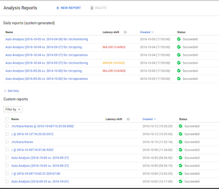
This functionality, along with the full suite of Stackdriver Trace features on the web-based Cloud Console, is available for all projects hosted on Google App Engine and any projects on Google Compute Engine and Google Container Engine that use the Stackdriver Trace SDKs (currently available for Node.js and Java). The latency reports can be accessed through the Analysis Reports tab within the Stackdriver Trace section of Cloud Console, or from the Trace tab of the Cloud Console mobile app. Links to endpoint-specific reports are found in the analysis report column of the Trace List page and under the Reports heading on individual traces in the Cloud Console.
Here’s an example of what you’ll see in Cloud Console for a project that's capturing trace data:
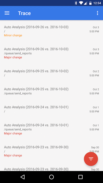
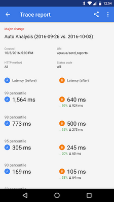
You’ll observe the following in the mobile app:

Latency reports are automatically generated for the endpoints with the highest traffic in each project; each of these reports compares each endpoint’s current latency profile to the prior week’s.
In the web-based console, selecting New Report allows you to create custom reports to observe the latency profile of a particular endpoint, or to compare the performance of an endpoint between different times and versions (see here for more details).
Some reports are flagged as having major or minor changes, which indicates that the latency distribution across percentiles is substantially different between the two versions or times being compared. These are often worth investigating, as they can represent changes in a service’s underlying performance characteristics.
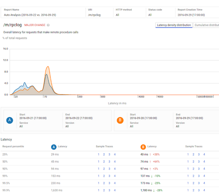
Each web-based report contains a graph of the endpoint’s latency distribution across percentiles. The auto analysis example above compares the latency profiles of a given endpoint over one week. As indicated by the graph and the “major change” text, the endpoint’s latency distribution has changed significantly over this time period.
The table at the bottom of the report shows that the application’s latency has increased in the 90th percentile and lower, while it has decreased in the higher percentile cases. This distinction is important: a simple comparison of the mean latencies between times A and B shows little change, but the report correctly identifies that the service is now considerably faster for the worst 10% of requests.
Here’s an example of a similar report in the mobile app, with a similar percentile comparison grid:
This feature will be available for the iOS Cloud Console app shortly.
For more information on how to create and understand latency reports, see this page. Let us know what you think about this feature, either by commenting here or through the send feedback button in Cloud Console.